Category: CSS Styles

Designer Work Tools 2013

comments Comments Off on Designer Work Tools 2013
By , November 9, 2013 15:33

I can already complaiine that none of the tools for live CSS editing, support SASS or LESS  (or other pre processor).

But they speed up your life so much we cannot complaine longer.

CSS updater

FireBug plug in http://www.cssupdater.com/
Prerequisites: Adobe Air, Firefox and minumum FireBug

Style Editor 1.0

https://addons.mozilla.org/en-US/firefox/addon/style-editor/?src=api
Requirements: Firefox 12.0 and later
Ma con Firefox 25.0 non compare il menu in right click

Synoptx LiveStyle

Propertary plugin build in PHP and Javascript is a multiplatform solution, adaptable for different CMS: WordPress Drupal Joomla. is the direct son of the propertary Spacecake CMS of the Web and Software Developer SynOptx.net

Colorpicker

What a waste Filezilla Colorpicker it copy just the color hexe code that are wrote in the css code

Colorzilla

Not only the best colorpicker on add ons market but also a precious tool for gradient generator!
Colorzilla pick also the value color from images, jpg… converting in webstandard Hex format.
If I can say something the only bad thing will be to have another standalone on the tollbar of my browser.

wtf/ pro minute on unbelievable levels

comments Comments Off on wtf/ pro minute on unbelievable levels
By , October 20, 2013 19:45

We got to work on a website were already 4 different groups (individual and studios) worked on.

Was a mess, we are collecting the best absurd thing from the code.

Have fun!

h2:first-letter {position: fixed;}

How to write not comments, comments are made to help understand, not playng role games while coding :

#conttopl .field-title {/*moved 2 line 832*/}

HTML5 Video

comments Comments Off on HTML5 Video
By , November 26, 2012 17:00

So, here we are, with the hope to kill Adobe flash player from our carrier.

The only chance ATM (at the moment) is HTML5 video embed.

the compatibility does not seem to be so good:

  • MP4 opera 10.6 does not support this format
  • OGG/OGV  explorer 9 and safari 5 do not support
  • webM explorer 9 and safari 5 do not support

WTF!!! we can anyway integrate all 3 formats::

  • .mp4 = H.264 + AAC
  • .ogg/.ogv = Theora + Vorbis
  • .webm = VP8 + Vorbis

<video poster=”immagine.jpg”>
<source src=”esempio.ogv” type=”video/ogg “>
<source src=”esempio.mp4″ type=”video/mp4″>
<source src=”esempio.webm” type=”video/webm”>
<p>this text will be visualized if the browser do not support HTML5. Download the video <a href=”esempio.webm”>here</a>.

</p>
</video>

You can also insert controls command inside the VIDEO tag

controls adds a default video control overlay;

width and height: dimensions with preload:

start the video download in autorun or not with preload=”none”
u stop it specify a codec inside the SOURCE tag

<video autoplay=“autoplay” loop=“loop” controls=“controls” tabindex=“0” preload>

<source src=”movie.webm” type=’video/webm; codecs=”vp8, vorbis”‘ />

<video>

 VIDEO + JS
explorer 8 does not read the tags, there are some ways to add theme in js:
<script type="text/javascript">
document.createElement('header');
document.createElement('footer');
document.createElement('section');
document.createElement('aside');
document.createElement('nav');
document.createElement('article');
</script>
or  use the already done files used in the file html5.js
For an even better compatibility with Flashplayer < 10 the fallback flash object requires flv file, not mp4.

Linkografy

http://it.wikipedia.org/wiki/HTML5_video

http://www.w3schools.com/html/html5_video.asp

http://www.html5rocks.com/en/tutorials/video/basics/

http://www.youtube.com/html5

http://www.html.it/articoli/il-tag-video-di-html5/

http://thewebthought.blogspot.com/2011/04/html5-and-internet-explorer-8-not-good.html

codecs="vp8, vorbis"

UNRESOLVED WP Multisite bugs

comments Comments Off on UNRESOLVED WP Multisite bugs
By , November 7, 2012 07:17

This post is WIP

WordPress 3.4.1

Plug in: WordPress Importer

Missed categories
“Ho notato un errore nel blog.
Zbog mi diceva che postavo le cose senza aggiungere le categorie
in realtà, quando posto le robbe dal network mexico,
mette le categorie , una volta ripostate da li nella pag centrale nn compaiono” PkT

Ravanando nell’installazione multisito trovo che effettivamente le categorie del sito principale e dei vari sottositi non combaciano.
Al contrario di PkT io postavo dal sito principale e nel correllato sito guinea le Category erano scomparse.
Ma anche le stesse categorie con stesso settings, non vengono riconosciute.
Creandone di nuove non compaiono nei siti correlati…

Ho trovato molto interessante questo Blog post

Don’t Use WordPress MultiSite


da dove traggo l’informazione che google e simili potrebbero leggere i post identici di un multisito come spamming, e far scendere di visibilità l’indirizzo del sito.
Quindi sarebbe meglio limitare il numero dei Post doppioni, meglio usare pagine che visualizzano tutti i post con le stesse category e tag.

Proprio ciò che non funziona!
proverei prima con una diversa plugin:

http://wordpress.org/extend/plugins/wordpress-mu-sitewide-tags

“This plugin creates a new blog on your server for all the posts on your site, much like http://wordpress.com/tags ”

CSS multisito
Suggerisco di dare un impaginazione standard, a tutti i siti nel network, almeno per quanto riguarda il box selector,
dato che se il post ha 3 foto in verticale una dopo l’altra affiancate dal testo grazie al posizionamento <align=”links”>
si perde il bordo vertical and horizontal settato nell’interfaccia.

Log in
altro bug se accedo dal sito principale, poi edito il post dalla dashboard del sottosito, e lo condivido sul principale non compare sul sito madre

:first-letter pseudo-element for drop cap

comments Comments Off on :first-letter pseudo-element for drop cap
By , July 19, 2011 17:03

If you want the  first-letter  of a <p>aragraph to look like Drop Cap (old fashion newspaper style), with a bigger letter floated to the left every browser shows up something different.

The main problem is to align in vertical the letter to the top of the text,the property vertical-align apply on the first-letter pseudo-element only if the float is set to none, that is a waste, the target I want to reach is big Letter with text around.  if I dont float the results, it shows a line break after the first line high like the height of the first letter.

Mozilla Firefox is the only one understanding a margin or padding from the top, so thumb up for this browser.

The developer tools presented in other browsers than Firefox dont allow me to edit the CSS in live, in order  to see faster which solution I can take.  for the other browsers I used the edit & try option of http://www.w3schools.com

IE6

This pretty article http://www.satzansatz.de/cssd/pseudocss.html discusses the classic IE behavior for typo and spacing errors,  IE6 requires an empty space between the class/id name and the comma and a space between the class/id  and the {} to read the properties

SOLUTIONS: Lets fight the Browser compatibility

  1. Using spans: create a span around the first letter is the mostly compatible solution, frequently used in the past, but does not work for dynamic created content, at least it does not without a script that add the span automagically
  2. insert line height and work on margin-bottom!
  3. Use a specified font for the first letter , where the uppercases are positioned into the font editor 4 pixel down to the bottom line (simply crazy for mostly common low payed jobs!)

thanks to this article (http://www.users.globalnet.co.uk/~arcus/html/dropcaps.html) I noticed that the margin bottom on the contrary of the margin-top it works in many browser!

Important is also the line height which forces the browser to think about the first letter like if was height like the text.

the results are still really different for each browser, that terrifies me and the letter  is frequently higher than the line. but acceptable.

HERE THE CODE:
/*TODO check IE6*/

p:first-child:first-letter{
float:left; /* Make the text flow around the letter */

font-size:3em;
margin:4px 4px 0px 0px;/*for firefox that is the only one reading the margin-top*/
margin-bottom:-0.25em;/*for the other browsers, Chrome, Opera*/
line-height:0.97em; /*Adjustment mainly for IE , help position the letter on the same height then the text,  that has 0.97em line-height/
}

Centering a div in Vertical

comments Comments Off on Centering a div in Vertical
By , May 24, 2011 16:57

Sprachkurier.de : the website is made from another crew, but the owner asked me to center the website vertically in the browser, and voila´

the idea is to give a vertical dimension of an empty div of 50% to get the middle of the height, and a margin bottom negative of the value of half of the height of the content DIV that need to be centered. That means that the content need a fixed height to be positioned.

here the code

——————————-
HTML
<div class=”floater”> </div>
<div id=”content”>
Content here
</div>

CSS
/* floater is required to center the content wrapper in vertical*/
.floater {
float:left;
height:50%;
min-height:120px;
margin-bottom:-400px;
border:1px solid transparent;
}
#content {/*main wrapper centered thanks to the 2 properties clear and position*/
clear:both;
position:relative;

height: 800px
}
———————————
The content is vertically center using this simple method, that I found in this  CSS blog ; but also if was declared as cross browser method,  the result was not working so well: with Firefox that was sometimes not rendering the floater as emptx div so that the content was jumping around, I  implemented the code adding an “invisible” border without background color to don´t let jump the div  and a min-height to preserve visibility on different screen size.

To make the border invisible I did not specified the color, or the color could be the same of the background.

NOW is a bit more cross browser 😉

If you work on small monitors and you are unsure if is working because the website is anyway higher then the browser, is enough to use CTRL –  to make the website proportions smaller.

Valid XHTML 1.0 Strict

Those are the regular cross browser tests we make : Internet exploder 6, 8, 9; Safari, Chrome, Opera, Firefox

on linux, mac and pc.

Monitors dimensions: 1920×1080, 1280×800, 4:3 and 16:9, netbook and Sony Ericson mobile Walkman and Android mobile phone
Nevertheless after we used our machines we let run some test on this web utility http://browsershots.org/

———————————————————————————————————

CSS gradient background and Mobile browsers

comments Comments Off on CSS gradient background and Mobile browsers
By , May 18, 2011 21:09

While making the layout for a mobile app with the help of jquerymobile, I have questioned myself about the gradient background, for web and mobile.

Looks like the mostly used mobile browser is Opera Mobile – Opera mini,that since the end of 2010 replace “Web (mobile) Browser for S60” the default browser for the mostly sold operative system Symbian OS (originally Nokia propertary made after Open Source!),. Has a stable position with “29.2% of worldwide smartphone market share in 2011” (Wikipedia).

2nd  place is the Android that is increasing users!
3rd place for Iphone with iOS and Safari.
The mobile browsers are born around 1996, in text only mode, around 2006 start the usage of CSS2.1, but the hardware developed so fast that there is no old browser engine to fight with,  thee is just the choice or they cannot show a graphic layout or they render better of your others monitor.
So the list can be restricted to:

/* Safari, Chrome, Skyfire, Nokia Series 60, Polaris, BlackBerry, Android*/
background: -webkit-linear-gradient(bottom, #006353, #c7dad6);

/*Portable Firefox, Firefox Mobile Fennec 1.0 Alpha 3, SeaMonkey Portable 2.0.14*/
background: -moz-linear-gradient( center bottom, rgb(0,98,83) 50%, rgb(0,113,94) 50%, rgb(199,218,214) 99%);

/*Opera Mini & Opera Mobile*/
background: -o-linear-gradient(bottom, #006353, #00715e, #c7dad6);

/*IE mobile */
-msfilter:”progid:DXImageTransform.Microsoft.gradient
(startColorStr=’#81aea7′, EndColorStr=’#81aea7′)”


For the computers Windows XP is always on the top usage, also if Windows 7 is increasing, but with a luck windows user start to leave Internet Explorer that is still on the top but decreasing, followed from Firefox and an increasing number of Chrome users. The fact that IE6 is still there make us brrrrr, IE6 is going down but is anyway counting almost the same users like Safari.
The CSS code for the computer web compatibility is really long:


/* W3C Standard */
background:linear-gradient(bottom, #81aea7, #c7dad6);

/* Safari 4-5, Chrome 1-9 */
background-image: -webkit-gradient(
linear,left bottom,left top,
color-stop(0.5, rgb(0,98,83)),
color-stop(0.99, rgb(199,218,214))
);

/* Safari 5.1+, Chrome 10+ */
background: -webkit-linear-gradient(bottom, #006353, #c7dad6);

/*Mozilla/Gecko (Firefox >= 3.6 etc) */
background: -moz-linear-gradient(
center bottom,
rgb(0,98,83) 50%,
rgb(0,113,94) 50%,
rgb(199,218,214) 99%
);

/* Opera 11.10+ */
background: -o-linear-gradient(bottom, #006353, #00715e, #c7dad6);

/*IE 5.5 – 7*/
filter: progid:DXImageTransform.Microsoft.Gradient(StartColorStr=’#006353′, EndColorStr=’#c7dad6′, GradientType=0);

/*IE 8+*/
-msfilter:”progid:DXImageTransform.Microsoft.gradient
(startColorStr=’#81aea7′, EndColorStr=’#81aea7′)”

You could add even one more exception, for a while Opera used an external svg to create the gradient, but the work is not worth.


So many lines that makes me nostalgic about the old way to do it, that now can be used as fallback in emergency:

/* fallback, Opera <=10 */
background-color: #1a82f7;
background: url(images/linear_bg_2.png);
background-repeat: repeat-x;


Linkography
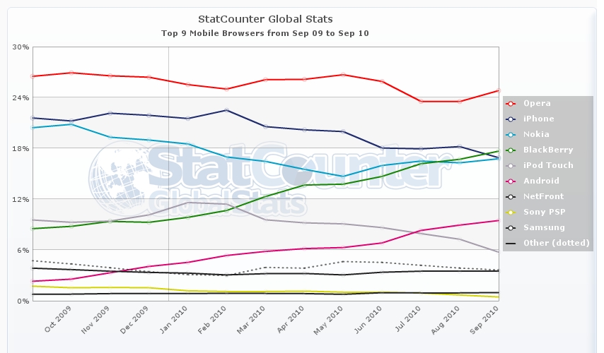
mobile browser counter

http://gs.statcounter.com/#os-ww-monthly-201004-201104

http://en.wikipedia.org/wiki/Usage_share_of_web_browsers

http://en.wikipedia.org/wiki/Mobile_browser

thanks for the great work:
http://www.normansblog.de/demos/browser-support-checklist-css3

Color Scheme Generator

By , August 15, 2010 11:28

I personally prefer to choose the Color Code by myself but when you suggest multiple sketches can be an help to dont repeat yourself.
the best tool is free to use on-line:
colorschemedesigner
with Html / Css / text / ACO (photoshop palette) / GPL (Gimp palette!) generator to save the color schem

Linux tools:
Firefox Plugin: Palette Grabber 0.4.1 [testing now come back visit us to know more!]

http://registry.gimp.org/node/15833 [Python plugin!]

AGAVE
ich spiele gerade mit diesen color code generator Agave
Agave is nothing special is only 1,262 kb big

I have found a Python plugin to let Agave run in Gimp ::
Color Scheme Helper for Gimp

A Python plugin that start the color scheme designer Agava for creating a new color scheme. The created color scheme can be saved as a Gimp color palette and loaded into Gimp.
In the software engine the only pretty idea is the contrast between text-background calculation…
changing the color automatically shows if is better a white or a black text on top of this color: Agave calculate if the bg color has a number higher then 555555 THEN the text is black and the opposite when the choosed gamma color is darker then 555555 the text will be white.

I m using AGAVE  as teaching tool, to show direct example of text contrast to graphic design students.

#tk: based on math – hmm naja interesting algorithm anyway … hehe ya should generate for special things like: body-font, screen-bgcolor, … i want some faders that automagically apply like livestyle to the site 😀 with correct pi and phi equations.

Color Scheme Generator version 3.51  has many new features!

The preview page I dont really like it use the colors in illogical contrast with the background

Style to Sell

By , August 12, 2010 15:28

There are some tricks to have “style”

When your graphical production does not look harmonic || professional || complete, you have to work on your sketches and find the main style (like a corporate identity) that represents the project.

Colors & Light
The colors change, based on the ambient light where you watch them, that means  if you want to have a realistic effect on your illustrations you cannot use a warm gray and a cold gray in the same image, in nature that will not happen.
But you can use those gray variants  to create a surreal image for example.
Remember that the colors are influencing the mood, so use them with a meaning.
If you are working on web, search for the standard  colors for similar projects, because the meaning of the colors is really different in the different continents and the meaning changes a bit even between the European countries.

Background
The Background is really boring to make but really important to do.
Empty background is a ZEN solution, white for day, and Black for night. works only in ZEN context.
None color works as a single color in professional illustrations.
If you want to use one tone a good suggestion is to make a material background:
*  take many different white and trow them together on the paper
* take a brush technique and use one color, you will get a single color but with brushes signs, a bit of 3D

Minimize or exaggerate
When something does not convince you, here is the best trick to be used:
* minimize: take it out and delete it, minimize the objects  and the number of images helps to make the structure easier to read and be modeled.
* exaggerate: the other way is to take this not stylish component and repeat it, use it multiple times, even always.
For example you are not sure if a text needs to have a Outline color, you can take out the Outline at all minimize(), or make it fat, stronger color and repeat it for multiple text on the composition (exaggerate).

Harmonia and Elegance
Don’t be afraid, is easy. Everything around you can be represented by math, mathematics as convention to explain the world, Music is math based, and Art too. You can compose your images with math help, use the “guide lines”  to see clearly the position of your object on the page, to calculate the empty spaces … and remember Math,  Geometry, Perspective, Harmonia and Elegance are all the same thing !
z.B. Leonardo Da Vinci
The elegance is into clear lines, so if you use a Vector Program  smooth your lines or draw with a smoother plugin activated:
Inkscape  you can realize this in many ways; for example take the tool ->  [ EDIT PATH BY NODES ]  ; now click on -> [ Make selected nodes symmetric ]
Elegance has few lines, not many particulars, like an Armani suite 😛
Harmonia is based on the cycle of the objects, how and how many times the object is represented.
If there is an object on the left and on the right is empty, that means the emptyness has a meaning, when there is no meaning make full the right side with something that balance the left content.

In history of art the idea of composition is always present, every artist uses a personal way to do it, but many people use the 3,14 rule, go check how the greek temples were built, how Eisenstein decided the video Editing of “Panzerkreuzer Potemkin”, how  Bruno Munari plans his graphics design.

Probably I will be banned from many Graphics websites after this post, because those tricks and tips are the precious knowledge of who work and study ART || GFX

but you know what? lets support and produce Evolution: OPEN SOURCE, OPEN MIND, NOT COMMERCIAL, SHARE ALIKE

Alice Z Bognetti

Firefox Firebug plugins for designer

comments Comments Off on Firefox Firebug plugins for designer
By , August 4, 2010 16:06

Well supercool plugins for designers arrived fresh on FireBug

Pixel Perfect
Add the layout design in alpha transparency directly over the website in the browser.

CSS usage
Check which css properties are actually called from the code and applied. NOTICE: not everythin inactive is not used, it analyzes only the current page

(I love Firebug!)

WordPress Open Source Blog System
SynOptX Lab Theme